Tutorials Ui
The LDaCA app interface is organised into three columns containing eight main sections. This page describes each section and how they work together.
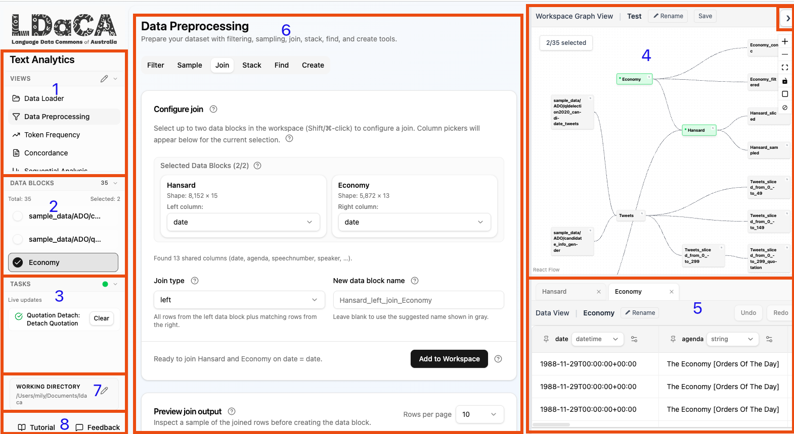
The left sidebar lists the available tool modules. Click a tool name to switch the main area (section 6) to that tool's interface. The available tools include:
- Data Loader — create or load workspaces and upload data files.
- Preprocessing — filter, sample, join, stack, find, and create columns.
- Token Frequency — count and explore the most common terms.
- Concordance — inspect search terms in their surrounding context.
- Trends and Sequence — count documents over time or any ordered numeric axis.
- Topic Modelling — discover themes using BERTopic.
- Quotation Extraction — capture quoted speech with speaker and verb annotations.
The edit icon next to the heading lets you customise which tools appear.
Below the tool list, the Data Blocks panel shows every data block in the active workspace. It is both a quick selector and a live indicator of what is selected in the Workspace Graph View (section 4) — selecting a block here is equivalent to clicking the corresponding node in the graph, and the two panels always stay in sync. It is especially useful when the right column is hidden.
- The total count and the number of currently selected data blocks are shown at the top.
- Click a data block to toggle its selection. Click again to deselect it. For tools that require more than one data block (e.g. Join or Stack), simply click each block in turn to build up a multi-selection.
- A filled circular checkbox indicates a selected data block; an empty circle indicates an unselected one.
- The list is sorted so that selected blocks always appear at the top, ordered by most recently selected first. Unselected blocks follow in alphabetical order.
- Selected data blocks automatically populate the tool interface (section 6) and the Data Viewer (section 5).
- Most tools can only process a limited number of data blocks at a time; by default these are the most recently selected ones.
The Tasks panel sits below data selection and projects background Analyses from the active Workspace together with your retained User File Imports.
- Analysis rows show progress and status only. Use the Analysis's owning Tab to cancel, clear, or re-run it.
- Queued and running User File Imports show Stop. The row remains visible if cancellation fails so you can try again.
- Successful, failed, and cancelled User File Imports remain available until you click Clear. Clearing the task removes its retained history record, not any files it successfully imported.
- Live updates keeps the panel refreshed automatically so you can continue working while tasks run in the background.
Note: The entire right column (Workspace Graph View and Data Viewer) can be collapsed to save screen space. Click the top-right arrow button to hide or show the right pane.
The Workspace Graph View occupies the top-right area and visualises Data Block creation lineage. Every Data Block is a node, and creating a Derived Data Block draws an edge from parent to child. Updating an existing Data Block does not change the graph.
- Click a node to select that data block across the entire interface. Click it again to deselect. Selections made here are reflected immediately in the Data Blocks panel (section 2) and vice versa.
- Hover a Data Block and open its settings menu to Rename, Clone, Undo, Redo, or Delete it. Undo and Redo availability comes from that Data Block's current backend session history.
- Use Rename to rename the active workspace.
- Pan and zoom the graph with your mouse to navigate large workspaces. A control panel sits at the top-right corner of the graph with the following buttons:
- Zoom in — increases the zoom level.
- Zoom out — decreases the zoom level.
- Zoom to fit — resets the view so all nodes are visible at once.
- Lock — toggles whether nodes can be dragged. When locked, node positions are fixed; panning and zooming still work.
- □ / ▣ Overview — toggles a minimap in the bottom-right corner of the graph, giving a bird's-eye view of the full workspace layout. Click again to hide it.
- ⊘ Clear selection — deselects all currently selected data blocks at once. Greyed out when nothing is selected.
- Asterisked nodes indicate the currently selected data blocks.
The Data Viewer fills the bottom-right area and displays the contents of selected data blocks in a tabular format.
- Tabs along the top let you switch between multiple selected data blocks.
- The Data View sub-tab shows the raw table; the Rename button lets you rename the data block.
- Undo and Redo revert or reapply the selected Data Block's most recent plan edit. The same actions are available in the graph Data Block menu. History is independent per Data Block, stores at most 50 plans, and lasts only while the Workspace remains open in the backend process. Closing and reopening preserves the latest data but clears both buttons.
- Each column header shows the column name and its data type (e.g.
datetime,string). Click the settings icon on a column to rename or delete it; use the data-type menu to convert its type. These operations update the selected Data Block without creating a new one. When converting, the app attempts to guess the date format automatically. This works for many common formats but can fail or produce incorrect results when the format is ambiguous (e.g.01/02/03could be read as DD/MM/YY, MM/DD/YY, or YY/MM/DD). If the conversion fails or the dates look wrong, use the Format field to specify the format explicitly using Python strftime/strptime codes. Common examples:-
%Y-%m-%d→2025-05-06 -
%d/%m/%Y→06/05/2025 -
%m/%d/%Y→05/06/2025 -
%Y-%m-%dT%H:%M:%S→2025-05-06T14:30:00(ISO 8601) -
%d %b %Y→06 May 2025 -
%B %d, %Y→May 06, 2025
-
- Click any row to open the Row Details panel, which displays the full contents of that row in a readable layout. The row details panel has two sections:
-
Document — shows the full text of the data block's designated document column (the column marked as the primary text when the data was loaded, e.g. the column named
text,document, ordoc). The section heading displays the column name, e.g. Document: text. If no document column has been configured for the data block, this section is omitted. - Metadata — shows all remaining columns as a two-column key/value table, making it easy to inspect structured fields such as speaker, date, or source alongside the document text.
-
Document — shows the full text of the data block's designated document column (the column marked as the primary text when the data was loaded, e.g. the column named
- The table is paginated — use the controls at the bottom to navigate through large data blocks.
- Scroll vertically with your mouse scroll wheel. Hold Shift to scroll horizontally.

The centre column is the main working area and shows the interface of whichever tool is selected in section 1. Each tool provides its own configuration options, previews, and action buttons.
- The tool name and a short description appear at the top.
- Sub-tabs (e.g. Filter, Sample, Join, Stack, Find, Create in Preprocessing) let you switch between related operations within the same tool.
- Most tools follow a common workflow: configure parameters → review a preview → choose whether to create or update when offered → click Create Data Block or Update Data Block. Filter, Find, Create, and Expression offer both modes and default to creating a new block. Sample, Join, and Stack are create-only.
- Help icons (?) are placed next to individual controls and link directly to the relevant written Help section.
The Working Directory indicator at the bottom of the left sidebar shows the local file-system path where workspace data is stored.
- Click the edit icon to change the directory.
- All workspaces, uploaded files, and exported outputs are stored under this path.
- The default location is
~/Documents/ldaca. This applies when running the app locally — via self-hosting, the Tauri desktop app, or UVX. - This section is not available in multi-user mode, where storage is managed server-side.
The Help and Feedback buttons at the very bottom of the left sidebar provide quick access to assistance.
- Help opens the built-in written guides in a floating window (the one you are currently reading). Clicking any ? icon scrolls Help to the relevant section.
- Feedback opens a form where you can report bugs, request features, or ask questions. Your feedback goes directly to the developer team. Please do not include any confidential information.
- A Contextual Hint may appear after a successful action when a feature has a short next-step message. Choose Got it or press Enter to acknowledge that version. It will not appear again on this device unless its guidance is updated.
- Contextual Hints can be disabled under Settings → Guidance. The same page can reset acknowledgment history for the current user. This release includes the guidance framework but does not ship automatic Contextual Hints.
- A replayable Guided Tour is shown in Help only when one is available. A tour is started deliberately and is unaffected by the Contextual Hint switch.